Dart #7: Homepage part 1
Hello there! Sorry I have been away for a few weeks due to uni work and other stuff, but today we will start working on the homepage of Teamoji, which will be the last page left, before we start hooking up everything and starting with Firebase!
As I mentioned before, due to the complexity of the app, we will split this page into a few posts. In this post we will work on the main content, which consists a header, a list of recent posts, and a button to post new emoji.
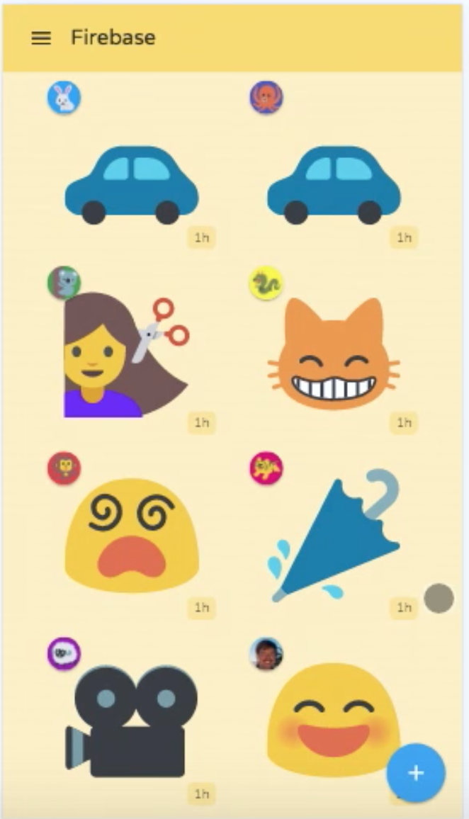 Our goal today
UserPostComponent
At this point, you should have a bit of an “Angular” senses about how to implement things, given Angular’s features and principles. It is not hard to see we would want a component for one post by a user, and in the main component we would simply *ngFor a bunch of this sub-component.
So let’s build that.
First you should consider what exactly this UserPostComponent should do. It should display a posted emoji by a user. From that, we see there are actually two things needed for this component to display:
a
Userwho posted this emoji.What emoji it is.
As a result, we would want to have 2 @Input() bindings from upstream, and that’s exactly what we will do.
user_post.dart
import 'package:Teamoji_tutorial/src/emoji_render/emoji_render.dart';
import 'package:angular/angular.dart';

@Component(
selector: 'user-post',
templateUrl: 'user_post.html',
styleUrls: const ['user_post.css'],
directives: const [
EmojiRenderComponent,
],
)
class UserPostComponent {
@Input()
String emoji;

@Input()
String userName;

String get shortUserName => userName.trim().toUpperCase().substring(0, 1);
}
user_post.html
<div>
<div class="tm-user-post-user-icon">
<div class="tm-user-profile-image"></div>
</div>
<emoji-render [useBigIcon]="true" [icon]="emoji"></emoji-render>
<div class="tm-user-post-timestamp">1h</div>
</div>
user_post.css
.tm-user-profile-image {
border-radius: 50%;
height: 30px;
width: 30px;
background-color: dodgerblue;
color: white;
display: table-cell;
text-align: center;
vertical-align: middle;
}

.tm-user-post-timestamp {
text-align: right;
color: lightgray;
}
I won’t go into detail about how this component is built. Everything should be fairly easy to grasp. There’s one bit that requires some thinking though, which is rounding the div for shortUserName but still make the text centered. The last three lines in .tm-user-profile-image realize that. Take a second look and really understand the reason for each line.
Another thing worth mentioning is that tapping on a recent post doesn’t do anything, hence no @Output() event needed.
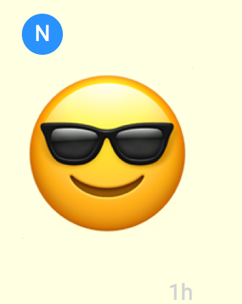 I am cool kid!
Main homepage content
Now that we have UserPostComponent, it is finally time to start building our homepage.
As we considered before, for now the homepage will have 3 main components:
a header.
a list of
UserPostComponent.a button to post new emoji.
Let’s double check if we have everything needed. The header will be an “icon button” plus some text, this is easy. The main section is a list of posts, which we have as well(for now we will mock a list of emojis, but eventually this should be pulled from Firebase). And last the button to add new emoji. There’s actually a designated name for this sort of button on the lower right side on page, according to Angular Material Design: Floating Action Button, which we can just use out of the box. So we have everything we need, let’s build it.
homepage.html
<div class="tm-main-content">
<div class="tm-main-content-header-row">


<div class="tm-main-content-header-title">Header</div>
</div>
<div class="tm-main-content-content">
<ul style="padding-left:0;">
<li class="tm-prev-emoji-item">

</li>
</ul>
</div>
<material-fab class="tm-add-post-icon" aria-label="add" raised (trigger)="onAddPost()">
<material-icon icon="add" size="x-large"></material-icon>
</material-fab>
</div>
homepage.dart
import 'dart:async';
import 'package:Teamoji_tutorial/src/common/messages.dart';
import 'package:Teamoji_tutorial/src/create_team/create_team.dart';
import 'package:Teamoji_tutorial/src/services/firebase_service.dart';
import 'package:Teamoji_tutorial/src/user_post/user_post.dart';
import 'package:angular/angular.dart';
import 'package:angular_components/angular_components.dart';

enum ShowingComponent {
homepage, create_team, emoji_selector,
}

@Component(
selector: 'homepage',
directives: const [
MaterialButtonComponent,
MaterialFabComponent,
MaterialIconComponent,
MaterialListComponent,
MaterialListItemComponent,
NgFor,
UserPostComponent,
],
templateUrl: 'homepage.html',
styleUrls: const [
'homepage.css',
])
class HomepageComponent extends HomepageMessages{
List<String> _mockEmojiList = const [
'\u{1F60B}',
'\u{1F60E}',
'\u{1F60D}',
'\u{1F618}',
'\u{1F617}',
'\u{1F619}',
'\u{1F60B}',
'\u{1F60E}',
'\u{1F60D}',
'\u{1F618}',
'\u{1F617}',
'\u{1F619}',
'\u{1F60B}',
'\u{1F60E}',
'\u{1F60D}',
'\u{1F618}',
'\u{1F617}',
'\u{1F619}',
];

List<String> get previousEmojis => _mockEmojiList;

void onAddPost() => print('should show select emoji component');
}
At first let’s do zero css and see what we got.
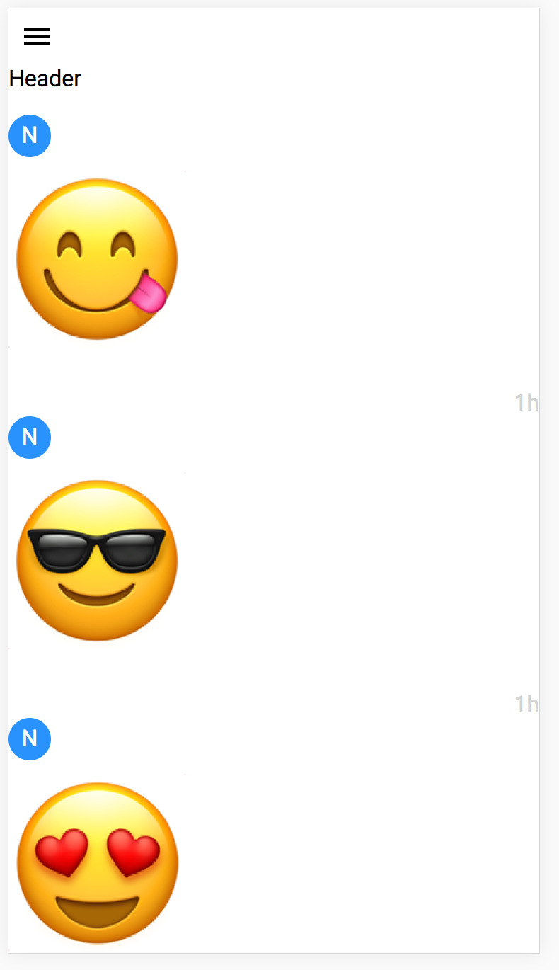 Yeah… You gotta make a bit more sense than that.
In the next section let’s work carefully with css and the page more like a page.
CSS homepage
In this section I won’t go too deep into stuff like font and color. We are going to focus mainly on layout.
First let’s make the root div stretch to full screen, adjust the background color too.
.tm-main-content {
background: lightyellow;
height: 100%;
width: 100%;
}
This won’t change any layout. Our next goal is to make the header text and the button in one row, and use a different background color to mark the header part. There are many ways to do that, but ultimately we need to change the display attribute for the header top-level div. By default it is set to block, which just stacks child elements vertically. Hence the above picture.
.tm-main-content-header-row {
background-color: orange;
display: flex;
}

.tm-main-content-header-title {
padding: 10px 5px 0 0;
}
This fixes the header div for us. It is worth noting you want to have some padding for the text, otherwise it would touch the button at the upper bound since it is set to flex.
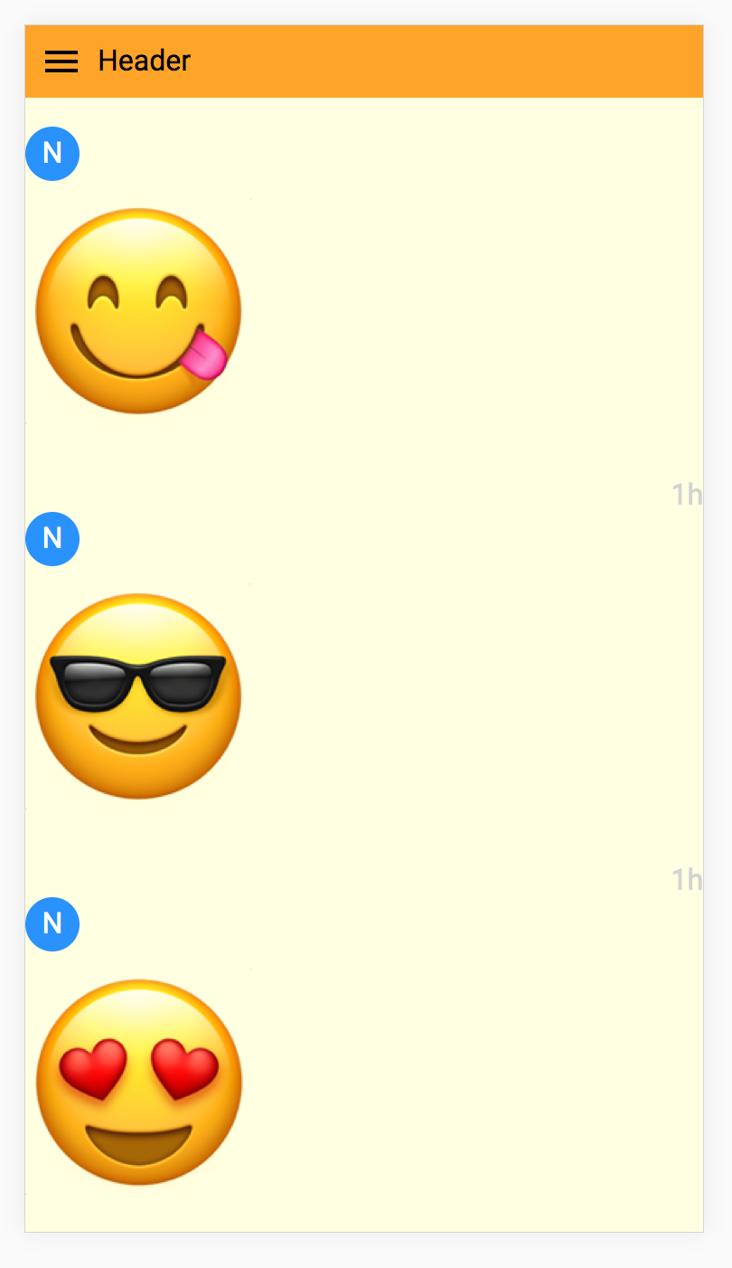 A bit better now.
Now let’s fix the user post list. The problem is the same as the header: display attribute. Here we want to have the posts stacked up, but use horizontal spaces too, this is done by setting it to inline-block.
.tm-main-content-content {
height: 100%;
padding: 8px;
}

.tm-prev-emoji-item {
display: inline-block;
padding: 0 20px;
}
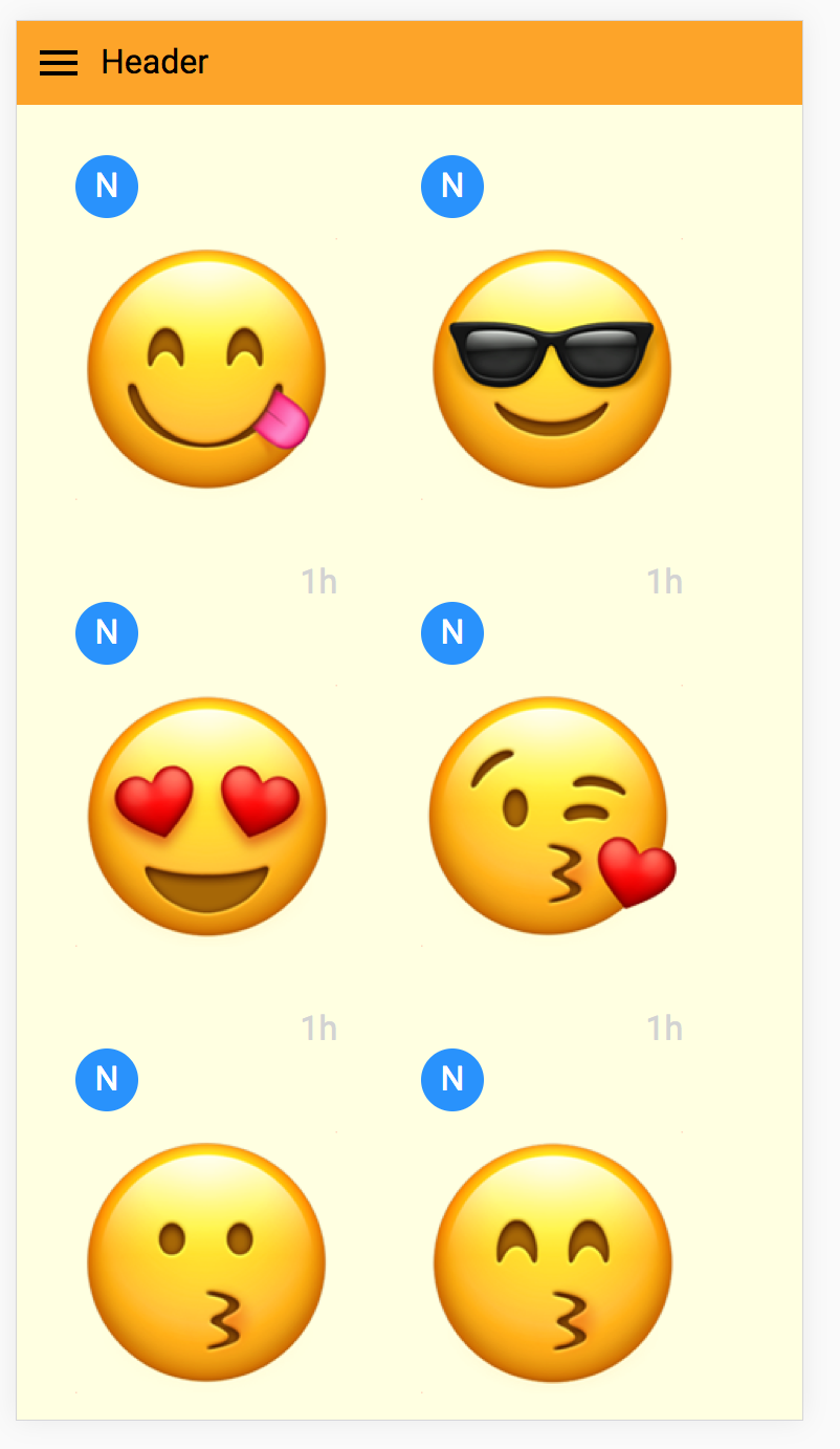 So close… Just missing the button now.
And lastly the FAB. Here we are just going to fix the position at the lower right corner of the page, even when scrolling.
.tm-add-post-icon {
color: white;
background-color: deepskyblue;
position: fixed;
right: 12px;
bottom: 12px;
}
After that, we should have the homepage nice and pretty.
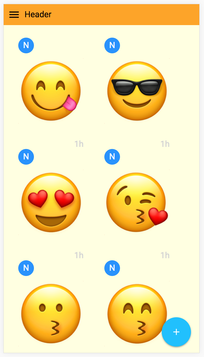 Nice and pretty indeed :D
Conclusion
Let’s recap what we did today. We created a sub component to display a post from earlier, and we have the main content of the homepage done. The most challenging part maybe playing with CSS, you might find this and this to be helpful in understanding display.
As usual, let me know if anything is unclear. Happy building!